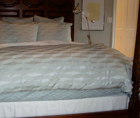
I have been working on a master bedroom renovation and it is almost finished but not quite. There are frames to be filled and drapes to be hung and a new nightstand in the plan, but it is 90% there. I tried to take some great photos to share when I was there today supervising some window treatment adjustments but they didn't come out very impressive.
I read somewhere that if you are taking photographs of a bed you should mess up the sheets a bit. Hmmm... that didn't work out very well - and why is it that EVERY wrinkle and flaw shows up on camera?
The room really is coming a long great (photo worthy or not) and I thought I would share the process a little. It all started with a large crack in the ceiling that needed to be repaired. There was other wear and tear and it so it was definitely time to paint. When I came in for the initial consultation we discussed colors and expectations. Simple, fresh and uncluttered is what I remember and the mention of blue. The bed would stay but it needed new bedding, the carpet would be replaced, new window treatments were needed and I could decide what should go on the walls (I love all that freedom!). The existing bedroom was dark and outdated with dark green carpet, a green and cream checked window seat cushion and an old Waverley floral on the canopy. It was time to be updated.
Since we were not going with custom bedding I started with what was available ready-made first. It does not make sense to choose a paint color or carpet first and then try to match bedding unless you are going to use custom fabrics. If you are working with existing carpet or paint colors then you have no choice but it is limiting. I did some online research and came up with some ideas and then we went out shopping together. Although we did not end up with the specific bedding I found online, it did guide us. What we found was simple and fresh and on sale (!) and we used that as our starting point. From there I selected the wall color (Benjamin Moore Metropolitan AF-690), lightened up the 'white' trim and cabinet color from Cottage White to White Dove and selected a beautiful oatmeal color wool carpet.
Once those were in place I was able to select the accent fabrics, window treatments, photo frames and lighting. I hung a gallery wall of frames that the client will use to frame some black and white photos of her family. Although it is not completely finished, it is already a beautiful and calming space that is fresh and updated and inviting.


Sherri, Is the Benjamin Moore 690 a grey or blue tone paint?
ReplyDeleteGood question Barb! It is a gray with a blue undertone. It will look gray on the swatch and at times during the day but most of the time it shows as the most lovely 'blue' tint on the walls.
ReplyDeleteI really like the soothing color palette, but then the punch of color with the floral pillow. Very pretty...
ReplyDeleteMerry Christmas, Sherri!
I love that blue floral pillow...I think I am entering a new floral era!!! Looks great with the awning stripe.
ReplyDelete