Before I blogged, I rarely took photographs of my work. I am learning through trial and error and also from reading wonderfully informative design blogs how to go about photographing rooms, especially before and after photos. You should take your before photos with the after photos in mind; taking both from the same angles. I didn't. You should also take your photographs during the daylight hours when you have plenty of natural light and you should never use a flash.
We worked all day and finished around 8PM at night - whew! The sun had gone down and the room has no lighting yet. So hello flash. It was the best I could do.
Here is the way the living room looked on my first visit:
The fireplace was large and too bulky for the room. It was also outdated and the client said she was never really all that happy with it. I wanted to get rid of the raised hearth to make more room for a conversation area. I did not like the way her sofa was so far away from the other chairs in the room. So we made a few changes.
We took out the hearth and replaced it with 2x4" travertine 'tiles' and a limestone hearth and added a beautiful custom mantle. The newly painted walls, baseboards and carpet give the room a fresh new look.
The painted mantle set the stage for a few other changes ... We replaced the light oak entry doors (double doors) with a single door with a sidelight and painted the inside white and the outside a beautiful shade of dark blue. We also painted the previously all oak staircase. Although the client loved her oak, painting some of it white really brightened up the house.
Updated staircase:
Here is the room before (to refresh your memory):
And here is the room now:
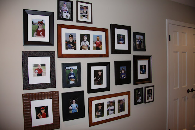
After we placed the furniture where we wanted it we went to work hanging artwork. In the downstairs hallway the client previously had some oak ledges that held her son's sports plaques. The kind that come with a small 2"x3" photo of your child and a group photo of the team put onto a wood plaque and covered with plexiglass. Her sons are grown now and the photos had faded. When we removed the ledges to paint she asked me about putting them back up. I suggested restoring the photos, enlarging them and putting them in nicer frames. She agreed. My sister worked her photoshop magic on the photos and enlarged them to fit in the frames that I had previously purchased. Then we placed the photos in the frames and arranged them the way I wanted them to be placed on the wall.
When I purchase frames to make an art wall, I place them the way I want while I am still at the store. I purposely select frames in different colors and styles to add interest. I try to buy more than I will need just in case. My preference is to put in black & white photos but for these photos the colors were important - they showed the team colors.
 |
| © Prizler Photography |
 |
| © Prizler Photography |
While we were placing the client's things back into her living room we noticed that her family photos were framed in outdated frames and they were not up to the level of the new living room. So we went out and purchased some new frames and hung a beginning family wall over her piano and reframed a beautiful family group portrait.


1 comment:
Looks great! The fireplace is such a huge improvement. And gallery walls are such a perfect solution to loads of family photos - they group together, make them look updated and I find that more people tend to enjoy standing there looking at them than they would if they were in frames on tables, mantels, etc :)
Post a Comment